Friday, June 11, 2010

Lab 8: Census 2000/2010

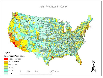
This map shows the population of Asians in each county. From the map, we can see that a lot of the population is in the southwest. There is a very small population in the middle of the United States. One thing that is interesting is that there is one county in Texas with over 100,000 while the rest of the state has a fairly low population. A similar thing is seen in Chicago as compared with other counties in the midwest.
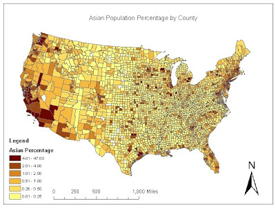
This map shows the population percentage of Asians in each county. This is the number of Asians divided by the total population. Again, there is a higher percentage of Asians in the southwest. While there are higher percentages in the middle of the US as compared to the population map, but it's important to notice that the highest range is over 4%. However, for the most part, the percentages follow the population map fairly closely.
This map shows the black population across the continental United States. From this graph, you can see a larger number of blacks in the southern regions the the United States as compared to the rest of the country. However, there are other parts of the country with a fairly high population, such as Detroit, Buffalo, and Chicago.
This map shows the black population density in the continental United States. In order to calculate this value, I had to take the black population and divide it by the county area. Once this column was determined, then I was able to map it. While the population map showed a large number in the south, the density map doesn't show as significant numbers in that area. However, in most other areas that had a high population, there was also a large population density as well.
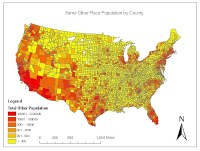
This map shows the population for "Some Other Race" across the United States. This shows that a large number of people in this group are in Southern California and Arizona, with some on the southern tip of Florida. Most counties across the US have less than 300.
This map is the population density of people identifying as "Some Other Race" across the US. Again, I had to do calculations on the given data to create another field that was mapped. This map did not have a good distribution. While many places have less than 10 people per square mile, there are a few counties with over 50.
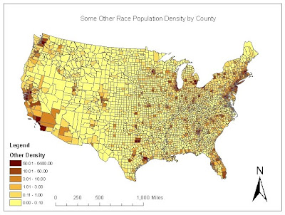
For this series of maps using census data, I found it much easier to make maps of the population rather than the density and percentage maps. The population maps had a better gradient that allowed the maps to have many counties with each color in the range. Also, I found that the population maps do not always reflect what the other maps will look like. While some had a direct correlation, other maps different greatly as compared to the population map. This lab was very helpful in creating applicable maps using accessible source data found online.
My overall impression of GIS is that it is a very powerful tool and it allows people to portray the information they want to show. There is a large amount of information that GIS can display and the programs used are very user friendly. Using ArcGIS, I found that while sometimes the steps are not completely obvious, once the user learns the tools, they can easily display any information they would like. In addition, there are many sources online that allows users to access the information and makes any information readily available for anyone wanting to use GIS.

Tuesday, May 18, 2010

Lab 6: DEMs in ArcGIS

The area that I looked at for this lab is a mountainous area just south of Palm Dessert and east of Temecula. While most of the terrain is mountainous, the northeast corner is flat because of where the dessert begins. There is also a very large peak directly in the middle of my map. This was a very good area to use for the lab because of the large variations in elevation and slopes. The extent of the area is N 33.6525 W 116.63389 on the northwest corner to N 33.3825 W 116.20111 on the southeast corner. The geographic coordinate system is the North American 1983.

Shaded Relief Model:
Slope Map:
Aspect Map:
3D Image:


Tuesday, May 11, 2010

Lab 5: Projections in ArcGIS

Map projection is the process of converting a three dimensional earth ellipsoid to a two dimensional surface through mathematical conversion. There are many different ways to make a map projection and each one has its own features. To start, the globe is projected onto either a plane, a cylinder, or a cone. All of these surfaces are able to then be unwrapped to take the form of a flat surface. The three main types of projections are conformal, equal area, and equidistant. Each of these map projections preserve a particular property: local shapes, areas, and distances.
While projections make it much easier to view the earth's surface on a flat plane, it does have its disadvantages as well. While some properties might be preserved, others will be greatly skewed. For example, in the mercator projection, while local angles and shapes remain the same, the areas change greatly. This is why when you look at the map, Alaska looks like it's the same size as Brazil.
For this exercise, we were asked to show 6 different projections of the world and map the locations for Washington DC and Kabul, Afghanistan. I made 2 of each type of map projection then used the measuring tool to find the distance in miles between the two locations. After finding all of the distance, I found the map projections can greatly skew long distances on a map. I ended up with a wide range of distances from as high as 10,082 miles to as low as 5,061 miles, a difference of 5,021 miles. The actual distance between the two cities is approximately 6,900 miles. We can see that using map projections can be dangerous when making measurements.
While map projections can seem to not be accurate when dealing with measurements and comparison of values like area and shape, they are still very important. The thing you have to remember about map projections is that it is meant for illustrative purposes. When using these maps, we are concerned with relative locations and not necessarily quantitative values.

Tuesday, May 4, 2010

Lab 4: Introducing ArcMap

I found the ArcMap tutorial to be very informative and helpful with understanding how to use GIS. The first four exercises were very straight forward and made it very easy for a first time user to follow along without any problems. Aside from a few hiccups, I worked through the these exercises very quickly and obtained the same results that were seen in the diagrams from the tutorial.
The last exercise I really enjoyed because they weren't as straight forward with the steps. They told you what you were supposed to do, and based on the previous exercises, you had to find out how to do that. This allowed me to realize how much I had learned so far and really test my skills with the program. Although the steps didn't really deal with data, I think that tinkering around with the formatting still allows a user to feel more comfortable using the program on future projects. I understand the importance of going through the tutorial multiple times in order to truly understand what each step means for the analysis of GIS.
Although the tutorial was very easy to use, it was also obvious that there were some pitfalls with using the program. First of all, it was not always clear how to take parts of information from one data set and use it with parts of another map. This means, although I was able to work through the tutorial easily, I do not know if I would be able to obtain similar results with my own data and analysis. Also, it is very easy to make mistakes using GIS and ArcMaps. The user has to be very careful to keep track of units, make sure proper figures are selected with doing any formatting or analysis, and verify that their analysis is valid and applicable.
Despite these pitfalls, ArcMaps and GIS has a lot of potential for creating very informative maps. GIS allows us to take data stored in different maps and overlap them onto each other in order to create many different maps with new information. Combining data is very fast and simple once a user has mastered using the program. It allows for simple formatting and has many features that makes the types of maps a person can make endless. GIS and ArcMaps is a very important tool that will continue to be used for creating informative and easy to read maps.

Tuesday, April 20, 2010

Lab 3: Neogeography

Map of some of the filming locations for the 2005 film "Crash".


View Lab 3: Neogeography in a larger map

While neogeography is very useful, there are many consequences for using their maps. First of all, the maps are user-centric. This means that it is created by the user with information intended for either a specific person or a specific group of people. Since it is created by the user, this means that there could be errors in the information provided. A person could easily create a map that has a lot of information, however, all of this information could in fact be false making the map completely useless.
Another pitfall of neogeography is that you are limited by the toolsets you are provided for creating the maps. In the case of using Google Maps, the user is only able to use tools created by Google. If there was some special format the user wanted the map in, he or she would have to use a different program to create their map. In addition to toolsets, you are also limited by the maps provided. Using Google Maps, you are not able to use a topographical map to create a mashup. Although the user is limited, programs like Google Maps continues to improve their tools in order to decrease the limitations users face when creating personalized maps.

Monday, April 12, 2010

Lab 2: USGS Topographic maps

1. The map is of the Beverly Hills Quadrangle.
2. The adjacent quadrangles
are:
-Canoga Park
-Van Nuys
-Burbank
-Topanga
-Hollywood
-Venice
-Inglewood
3. It was first created in 1
966.
4. The datum used to create ma
p are:
-North American Datum of 1927 (NAD 27)
-North American Datum of 1983 (NAD 83)
-National Geodetic Vertical Datum of 1929
5. The scale of the map is 1:24,000.
6. For the above scale:
a) 5 cm on the map is equivalent to 1200 m on the ground.
b) 5 inches on the map is equivalent to 1.89 mile on the ground.
c) 1 mile on the ground is equivalent to 2.64 inches on the map.
d) 3 km on the ground is
equivalent to 12.5 cm on the map.
7. The contour interval is 20 feet.
8. Geographic coordinates of:
a) Public Affairs Building: 34 deg 4' 30" N and 118 deg 26' 15" W or 34.075 deg N and 118.4375 deg W
b) Tip of Santa Monica pier: 34 deg 0' 24" N and 118 deg 30' 0" W or 34.007 deg N and 118.5 deg W
c) Upper Franklin Canyon Reservoir: 34 deg 7' 10" N and 118 deg 24' 30" W or 34.119 deg N and 118.408 deg W
9. Elevation of:
a) Greystone Mansion: 560 ft or 170.7 m
b) Woodlawn Cemetery: 1
40 ft or 42.7 m
c) Crestwood Hills Park: 700 ft or 213.4 m
10. The UTM zone of the map is zone 11.
11. The UTM coordinates for the lower left corner of the map is approximately northing 3763000 and easting 361500.
12. There are 1,000,000 square meters contained within each cell of UTM gridlines.
13. Elevation Profile
14. The magnetic declination of the map is 14 degrees east.
15. The intermittent stream between the 405 freeway and Stone Canyon Reservoir flows south since the elevation decreases in the this direction.
16. UCLA map:

Tuesday, March 30, 2010

Lab 1: SSC, SOD survey & a blog

Source: http://thepovertyjetset.com/wp-content/uploads/2007/09/roadless-map.png

This map shows the average distance a location is to the nearest road. Areas that are dark green are really far from a road where yellow means that there is a road almost everywhere. I found this map interesting because it can also be used as a population density map. Locations in yellow are generally in high population areas, while green areas have very few people. Coming from an area with roads everywhere, its very interesting to see the locations that have very few roads.


Source: http://politicalmaps.org/wp-content/uploads/2008/11/2008-election-map-wash-post-margin-3d.gif

This map shows the results of the 2008 election between John McCain and Barack Obama. I find this map interesting because it shows a lot of information and is very easy to read. First of all it shows which areas voted for who based on the location on the map and the color of the area. Second, it shows the margin of victory based on the height of the column. The higher the column, the larger the margin of victory.

Source: http://gocalifornia.about.com/od/calamenu/l/bl_la_freewaymap.htm

This map shows all of the freeways around Los Angeles County. It is very basic and just shows the main freeways and highways along with their associated number. I found this map interesting because although I've lived in the area my whole life and I know many of the freeways, I do not know exactly where many of the freeways go and all of their directions. When you drive on them, sometimes you lose track of what direction you are going, and this map allows you to see all of the turns these freeways actually make.