 Source: http://thepovertyjetset.com/wp-content/uploads/2007/09/roadless-map.png
This map shows the average distance a location is to the nearest road. Areas that are dark green are really far from a road where yellow means that there is a road almost everywhere. I found this map interesting because it can also be used as a population density map. Locations in yellow are generally in high population areas, while green areas have very few people. Coming from an area with roads everywhere, its very interesting to see the locations that have very few roads.
Source: http://politicalmaps.org/wp-content/uploads/2008/11/2008-election-map-wash-post-margin-3d.gif
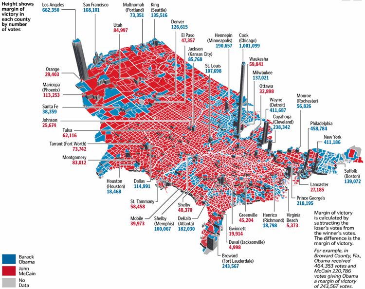
This map shows the results of the 2008 election between John McCain and Barack Obama. I find this map interesting because it shows a lot of information and is very easy to read. First of all it shows which areas voted for who based on the location on the map and the color of the area. Second, it shows the margin of victory based on the height of the column. The higher the column, the larger the margin of victory.
 Source: http://gocalifornia.about.com/od/calamenu/l/bl_la_freewaymap.htm
This map shows all of the freeways around Los Angeles County. It is very basic and just shows the main freeways and highways along with their associated number. I found this map interesting because although I've lived in the area my whole life and I know many of the freeways, I do not know exactly where many of the freeways go and all of their directions. When you drive on them, sometimes you lose track of what direction you are going, and this map allows you to see all of the turns these freeways actually make.